Covalent Prototyping (Material Design Spec, Angular-Material2, Mock API, Flexbox, Layouts & Design Patterns)
Preface
Material Design Spec https://material.io/guidelines/
Teradata has adopted Material Design as it would adopt any other open-source software. We get so much for "free", don't have to maintain it, we constantly get new updates, and since the world has adopted it we get resources and instant familiarity from both users and potential employees. The only rule (just like in software): DON'T HACK THE CORE. If you hack the core you break compatibility across the board and defeat the entire point.
The spec provides all the material components like:
Toolbar https://material.io/guidelines/components/toolbars.html
Cards https://material.io/guidelines/components/cards.html
Lists https://material.io/guidelines/components/lists.html
as well as patterns like:
Navigation Drawer https://material.io/guidelines/patterns/navigation-drawer.html
Errors https://material.io/guidelines/patterns/errors.html
Angular-Material2 https://material.angular.io/
Angular has won the adoption war. Angular 2 took at the best parts of Ember, React, and even inspiration from Java and Swift to delivery the most powerful & developer friendly JavaScript platform on the planet. Angular-Material is a direct implementation of Material Design in Angular 2, both from Google.
Components built straight from Material Spec
Toolbar https://material.angular.io/components/component/toolbar
Cards https://material.angular.io/components/component/card
Lists https://material.angular.io/components/component/list
etc
Covalent Components
Covalent components use existing Angular-Material UI components following the atomic design principles. For new components that don't exist in Angular-Material, Covalent components strictly follow the Material Design spec. If a component isn't covered (like the file-upload-button), Covalent tries to follow the spirit and guidelines of the spec.
Covalent Design Patterns
Beyond just demoing components in action, Covalent also features Design Patterns for UI usage that occurs frequently across products, such as login forms, metadata cards, and lists of items with search/sort/filter.
So to review: when building prototypes always check in this order:
- Covalent Docs & Design Patterns
- Angular Material Docs & Demos
- Material Design Spec
Flexbox Grid
https://material.angularjs.org/latest/layout/introduction
Covalent Material Layouts
https://teradata.github.io/covalent/\#/layouts
Mock API
Typically as part of the prototyping process, the UX engineer will work closely with the API team and define a mock API using Covalent-Data to speed up the prototype process and so when it's time to connect to real data, there are very few required UI changes. - we'll cover this later
Setup
(assuming you have all the prereqs setup properly)
Clone the repo
git clone [email protected]/ux/covalent-training.git
cd covalent-training
Copy the configuration file into the source directory
cp config.js.default src/config.js
Checkout the prototyping branch & install
git checkout -b feature/training
npm i
start the local @angular/cli server:
ng serve
you should see:** NG Live Development Server is running on http://localhost:4200. **
If you see a message about angular-cli run:
npm -g uninstall angular-cli
npm -g install @angular/cli
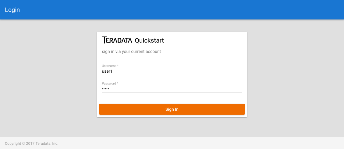
A login should load! Let's get to work!
Color theme
The color palette had many color options, and within each option many hue (shades) of that color:
https://material.io/guidelines/style/color.html
For example, light blue has these hues: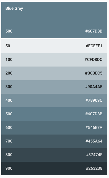
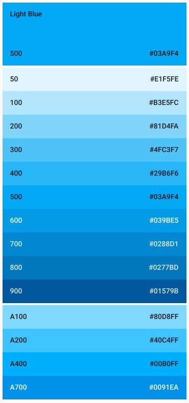
Teradata sub-palette
For Teradata apps we try to keep it limited to from teal <-> orange <-> grey, but there's lots of freedom there.
https://teradata.github.io/covalent/\#/style-guide/colors
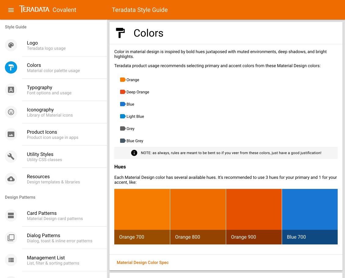
Color palette tools
Since we follow the material spec we have tons of resources for material color palettes such as:
https://www.materialpalette.com/light-blue/orange
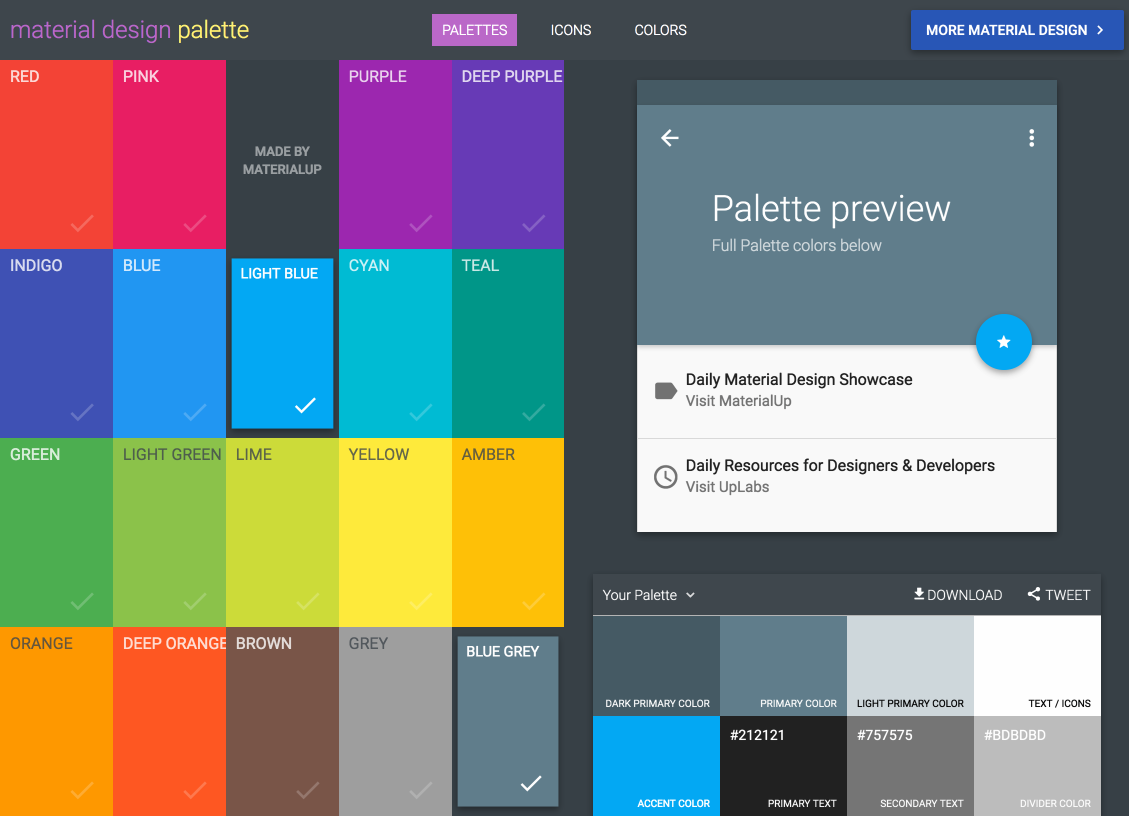
or if we want a quick desktop reference:
https://github.com/romannurik/MaterialColorsApp
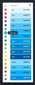
Change the Covalent theme
Covalent uses Angular-Material's prebuilt themes.
Edit /src/theme.scss
an all we have to change are these three lines:
$primary: md-palette($md-blue, 700);
$accent: md-palette($md-orange, 800, A100, A400);
$warn: md-palette($md-red, 600);
to
$primary: md-palette($md-blue-grey, 800);
$accent: md-palette($md-light-blue, 600, A100, A400);
$warn: md-palette($md-red, 800);
and now our login looks like:
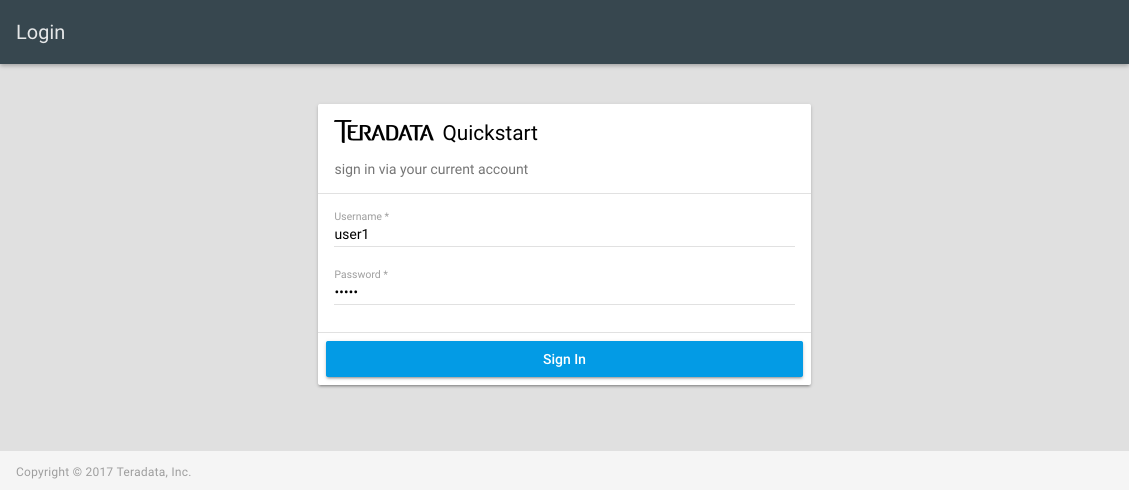
Login (super secure & secret!)
user: user1
pass: user1
and you should see an amazingly blank dashboard!
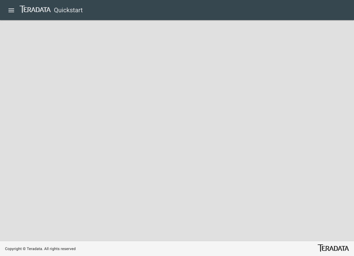
Changing app title in toolbar, navigation drawer and login
Referencing docs
Nav View Layout (for toolbar)
https://teradata.github.io/covalent/\#/layouts/nav-view
Nav Drawer (for sidenav)
https://teradata.github.io/covalent/\#/style-guide/navigation-drawer
Edit the toolbar title
/src/app/overview/overview.component.html
on td-layout-nav change
toolbarTitle="Quickstart"
to
toolbarTitle="Messages"
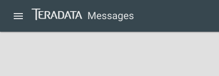
Edit the navigation drawer (sidenav) title:
/src/app/main/main.component.html
on td-layout-nav change
sidenavTitle="Quickstart"
to
sidenavTitle="Messages"
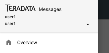
Edit the login title
/src/app/login/login.component.html
on td-layout-nav change
<span class="md-app-title">Quickstart</span>
to
<span class="md-app-title">Messages</span>
Responsive 60/40 flex layout for dashboard
Next up, I want 2 columns for cards
Reference the flex layout docs https://material.angularjs.org/latest/layout/introduction
/src/app/overview/overview.component.html
right before td-layout-footer i'll insert a row
  <div layout="row">

  </div>
by simply adding layout="row", all children elements will align horizontally
  <div layout="row">
    <div>
      child 1
    </div>
    <div>
      child 2
    </div>
  </div>

It might not seem like much, but we're putting CSS Flexbox to use already!
Now if I simply add flex to each child, they will stretch (or flex) to equally fill the row:
  <div layout="row">
    <div flex>
      child 1
    </div>
    <div flex>
      child 2
    </div>
  </div>

A little more exciting!
Now let's take it a step further and define specific flex widths of 60% and 40%
  <div layout="row">
    <div flex="60">
      child 1
    </div>
    <div flex="40">
      child 2
    </div>
  </div>

Ok we have our overall layout, but what about responsive breakpoints? I don't want 2 columns on mobile!
Flexbox layouts have a TON of features such as breakpoints that can be added to ALL the flex options:
- xs
- gt-xs
- sm
- gt-sm
- md
- gt-md
- lg
- gt-lg
- xl
- gt-xl
So for our use we simply want to say:
"flex row greater than xtra-small, and 60/40 widths greater than xtra-small":
  <div layout-gt-xs="row">
    <div flex-gt-xs="60">
      child 1
    </div>
    <div flex-gt-xs="40">
      child 2
    </div>
  </div>
Which will collapse down on xtra-small since divs are block elements by default:
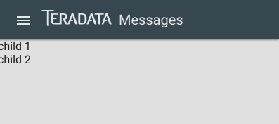
Now let's add some cards!
Cards
Cards are the common dashboard content holders in Material Design. To decide what style & markup to use we have three resources:
Material Spec: lots of examples and versions of cards https://material.io/guidelines/components/cards.html
Angular Material: our base cards https://material.angular.io/components/component/card
Covalent card patterns: several example of cards w/ other components https://teradata.github.io/covalent/\#/style-guide/cards
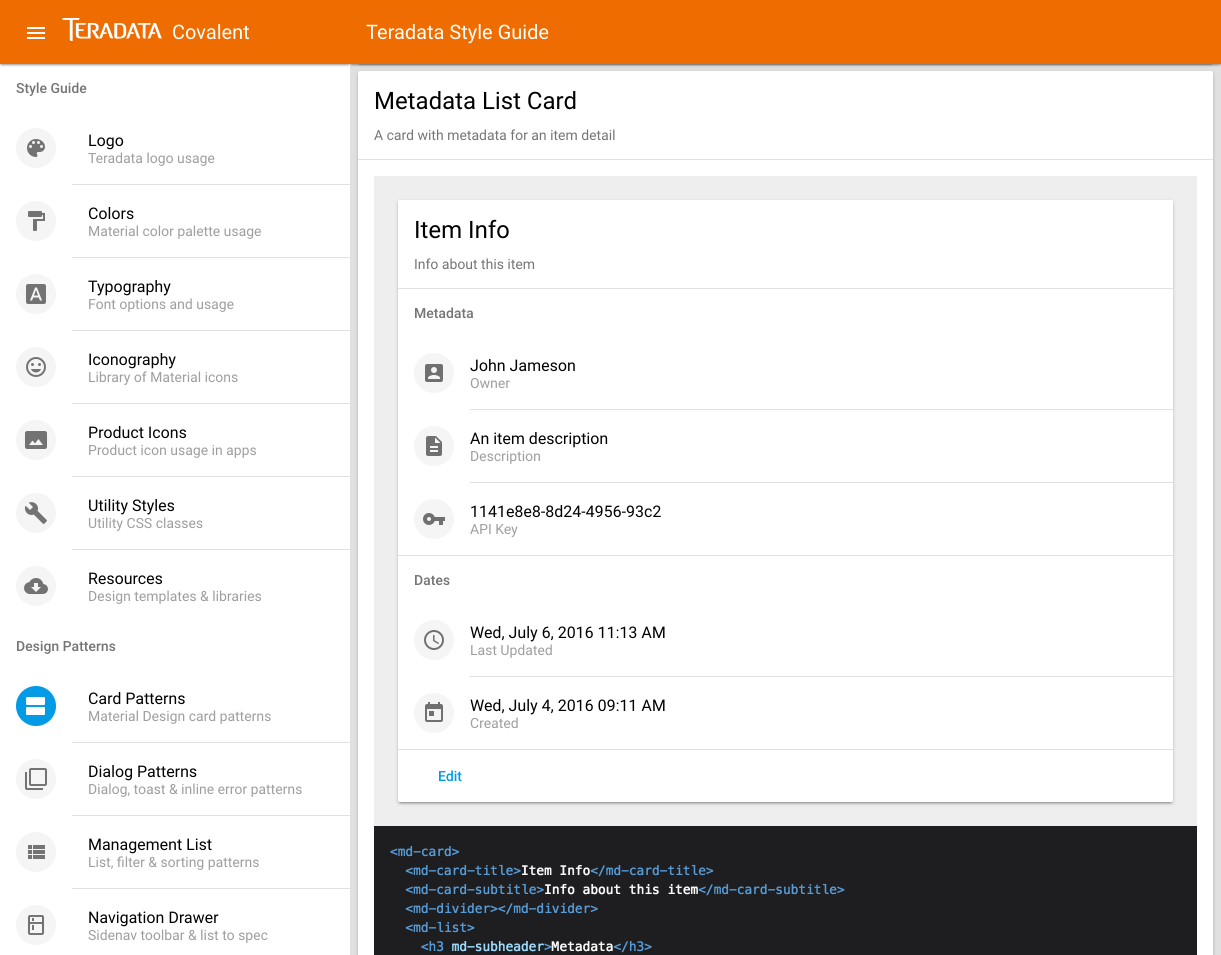
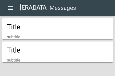
First we'll add the base card w/ title & subtitle
  <div layout-gt-xs="row">
    <div flex-gt-xs="60">
      <md-card>
        <md-card-title>Title</md-card-title>
        <md-card-subtitle>subtitle</md-card-subtitle>

      </md-card>
    </div>
    <div flex-gt-xs="40">
      <md-card>
        <md-card-title>Title</md-card-title>
        <md-card-subtitle>subtitle</md-card-subtitle>

      </md-card>
    </div>
  </div>

To get some better spacing around the cards we can use one of the man Covalent utility CSS styles found here:
https://teradata.github.io/covalent/\#/style-guide/utility-styles
We'll try push-sm for some small margin:
<div layout-gt-xs="row" class="push-sm">

that looks great! But we don't want that extra margin on mobile so we'll put a nifty Covalent directive to use so the push-sm class only gets applied greater than xs.
Covalent media queries
(like responsive design conditionals for classes, directives and html attributes):
https://teradata.github.io/covalent/\#/components/media
the first pieces is to match a responsive size, we want the class greater than xs so:
<div layout-gt-xs="row" tdMediaToggle="gt-xs">
and to apply the class gt-xs we use:
<div layout-gt-xs="row" tdMediaToggle="gt-xs" [mediaClasses]="['push-sm']">
(we could use multiple classes if we wanted to)
Now our cards look great on large and small browsers combining the responsive flex layout with Covalent media queries:
Adding a list of messages
Now let's add our primary content to the overview, messages!
We know we'll want the following metadata for messages:
- id
- title
- description
- created (date)
- updated (date)
- icon
- color
- user
As usual, reference your trifecta!
Material Spec lists https://material.io/guidelines/components/lists.html
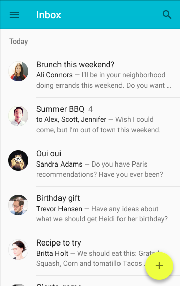
Angular Material lists https://material.angular.io/components/component/list
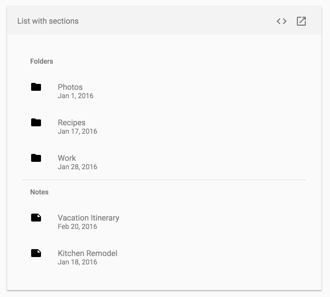
Covalent card w/ list pattern https://teradata.github.io/covalent/\#/style-guide/cards
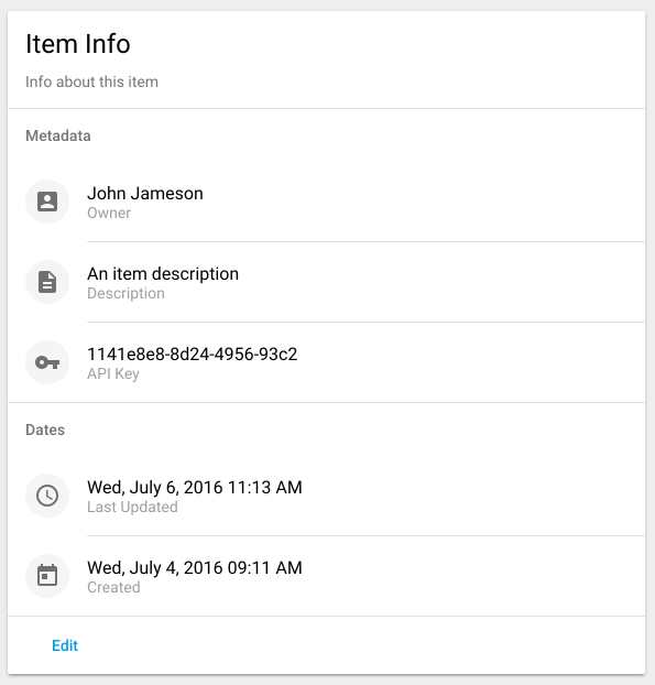
Ok so let's grab the markup from Covalent first since we KNOW it will work:
      <md-card>
        <md-card-title>Messages</md-card-title>
        <md-card-subtitle>most recent messages</md-card-subtitle>
        <md-list>
          <md-list-item>
              <md-icon md-list-avatar>account_box</md-icon>
              <h4 md-line>John Jameson</h4>
              <p md-line>Owner</p>
          </md-list-item>
        </md-list>
      </md-card>

ProTip: Notice that we used <md-list> without using <md-card-content> around it. If we used md-card-content we'd have unwanted padding around the list!
Let's deconstruct some of the options we have in a md-list-item:
- md-icon
- md-list-avatar: a light grey circle around the icon
- md-list-icon: just an icon with proper spacing to spec
- H3 md-line: largest font list text
- md-line puts the text on its own line
- H4 md-line: second largest font
- p md-line: smallest font in grey color, typically (but not always) a label
Let's mix and match some of these options to mimic a messages list
          <md-list-item>
              <md-icon md-list-avatar>account_box</md-icon>
              <h3 md-line>Message title goes here</h3>
              <h4 md-line>Firstname Lastname</h4>
              <p md-line>Message description goes here and it can be pretty long. At some point do we want the text to truncate...</p>
          </md-list-item>
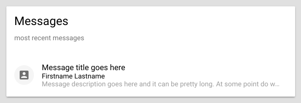
Ok great progress! Notice that the long text automatically truncates.
Now let's get crazy and go OUTSIDE the Trifecta of official specs to search for additional list inspiration. A great resource is Materialup, which is like Dribbble for Material Design. Let's search for messages there
https://material.uplabs.com/search?q=messages
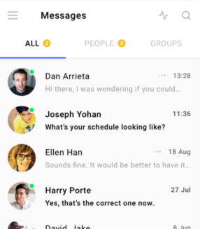
Ah, they display the date on the right, let's add that since we have that metadata!

          <md-list-item>
              <md-icon md-list-avatar>account_box</md-icon>
              <h3 md-line>Message title goes here</h3>
              <h4 md-line>Firstname Lastname</h4>
              <p md-line>Message description goes here and it can be pretty long. At some point do we want the text to truncate...</p>
              <div md-line>3 min ago</div>
          </md-list-item>
Well this isn't right, it's adding another row
Ah! If we remove the md-line attribute the content actually moves to the right! If we want to control the font color and size we can use Covalent utility styles!
Typography & Font Colors: (which all match Material Spec exactly!)
https://teradata.github.io/covalent/\#/style-guide/typography
md-caption is the smallest text perfect for date
tc- along with any material color + hue works so for grey we use tc-grey-600
<div class="md-caption tc-grey-600">3 min ago</div>
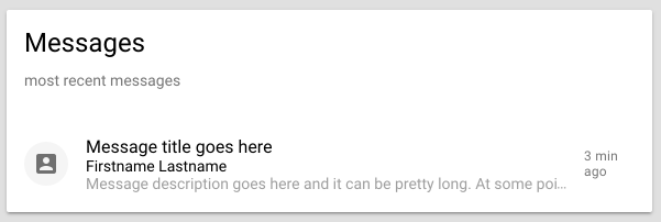
almost perfect but we don't want the text to wrap! Luckily we can add a handy flex layout attribute since we know the md-list-item has flexbox styles built in:
<div flex="none" class="md-caption tc-grey-600">3 min ago</div>
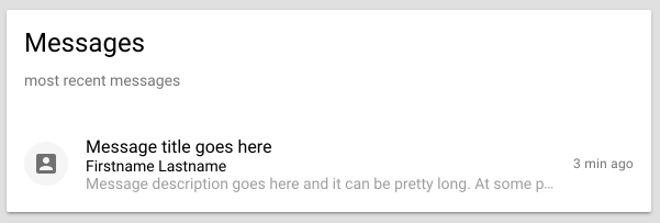
perfect!
So you see with playing around with all the Covalent tools we got exactly what we wanted without writing custom CSS or anything!
Let's add some dividers
Under the subtitle we typically like a divider
        <md-card-title>Messages</md-card-title>
        <md-card-subtitle>most recent messages</md-card-subtitle>
        <md-divider></md-divider>
and under each message a divider would be nice
          </md-list-item>
          <md-divider></md-divider>
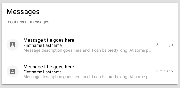
but an inset divider would be very material of us!
          </md-list-item>
          <md-divider md-inset></md-divider>
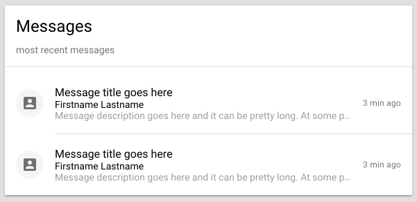
That's looking pretty good, let's copy and paste to fill the screen
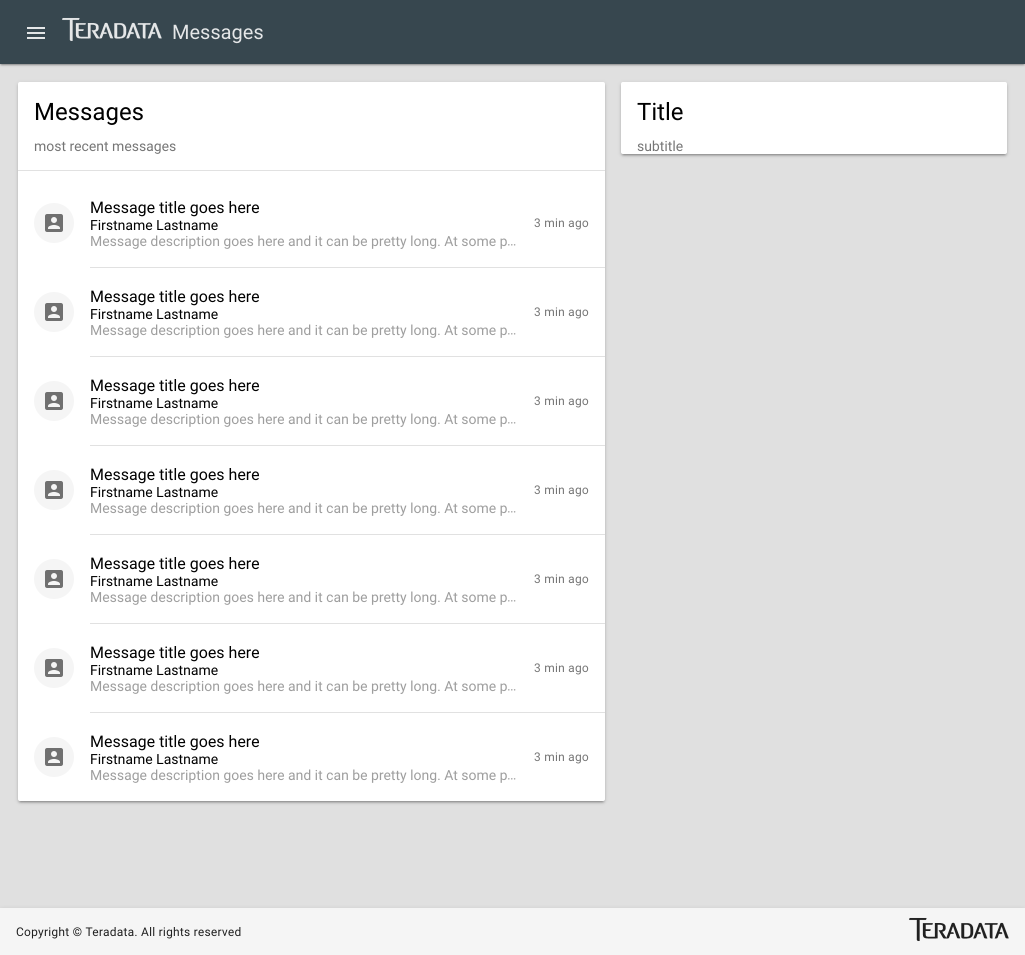
Ok thinking through the UX of our app, we'll want to click on a message to view a message detail
To flip a static list to a list of links is simple:
Refer to Angular-Material docs: https://material.angular.io/components/component/list
Navigation Lists is what we want!
change
<md-list>
to
<md-nav-list>
and each
<md-list-item>
to
<a md-list-item>
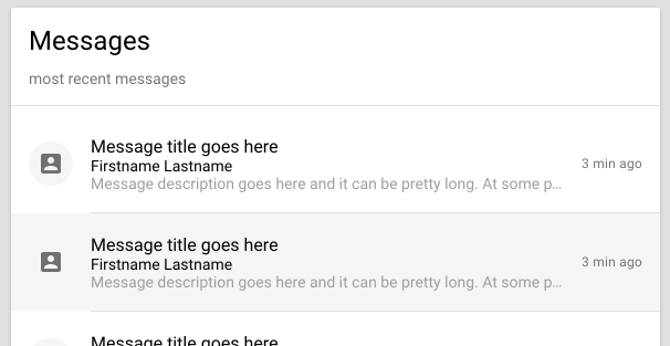
and how we have a hover state! (the route link will be added later)
What if we wanted the popular ... dropdown button in Material Design so we can have more options like Edit & Delete?
md-icon
First let's find the ... icon. Covalent includes all the Material Design icons so we can search:
and find that it's named "more_vert" https://material.io/icons/\#ic\_more\_vert
and then to use an icon we can check Angular-Material
https://material.angular.io/components/component/icon
and we find it's simply:
<md-icon>more_vert</md-icon>
md-icon-button
We need this icon to be a button so we reference
https://material.angular.io/components/component/button
and wrap the icon like so (notice md-icon-button is an html attribute):
<button md-icon-button><md-icon>more_vert</md-icon></button>
md-menu
This button will open a dropdown menu so we reference
https://material.angular.io/components/component/menu
with a few tiny modifications we use
              <button md-icon-button [mdMenuTriggerFor]="menu"><md-icon>more_vert</md-icon></button>
              <md-menu #menu="mdMenu">
                <button md-menu-item>
                  <md-icon>edit</md-icon>
                  <span>Edit</span>
                </button>
                <button md-menu-item>
                  <md-icon>cancel</md-icon>
                  <span>Delete</span>
                </button>
              </md-menu>
This is great! But in Material Design's spec, a menu on the right it suppose to open to the left!
We can use x-position (the x axis is left<->right) and select x-position="before" (before instead of left since we support RTL lanuages)
For one last tweak we'll use a Covalent utility class to nudge the date over a bit
              <span class="push-left-sm">
                <button md-icon-button [mdMenuTriggerFor]="menu"><md-icon>more_vert</md-icon></button>
                <md-menu #menu="mdMenu" x-position="before">
                  <button md-menu-item>
                    <md-icon>edit</md-icon>
                    <span>Edit</span>
                  </button>
                  <button md-menu-item>
                    <md-icon>cancel</md-icon>
                    <span>Delete</span>
                  </button>
                </md-menu>
              </span>
![]()
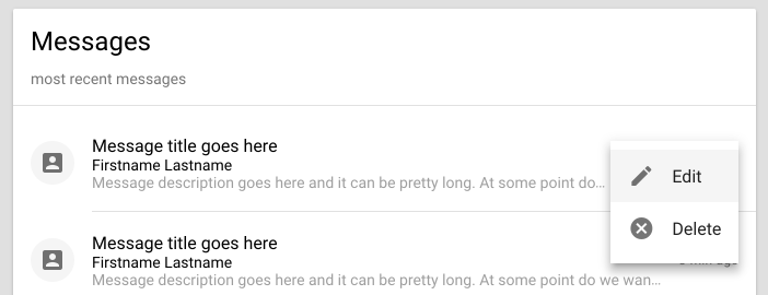
Great success!
Card action buttons
Keeping UX & Information Architecture in mind, we want to view a list of all messages by itself later so we'll add a View More button
If we check the Material spec for cards we see actions buttons
https://material.io/guidelines/components/cards.html\#cards-actions


From the spec we see buttons should go on the left:
Buttons are best placed on the left side of a card to increase their visibility. However, as cards have flexible layouts, buttons may be placed in a location suited to the content and context, while maintaining consistency within the product.
Sure enough if we check Angular Material we find md-actions-buttons
https://material.angular.io/components/component/card
Following Covalent & Material standards, we'll use an accent color, NOT raised (you don't use raised buttons in card actions typically)
        <md-divider></md-divider>
        <md-card-actions>
          <a md-button color="accent">View More</a>
        </md-card-actions>
Our Overview is shaping up!
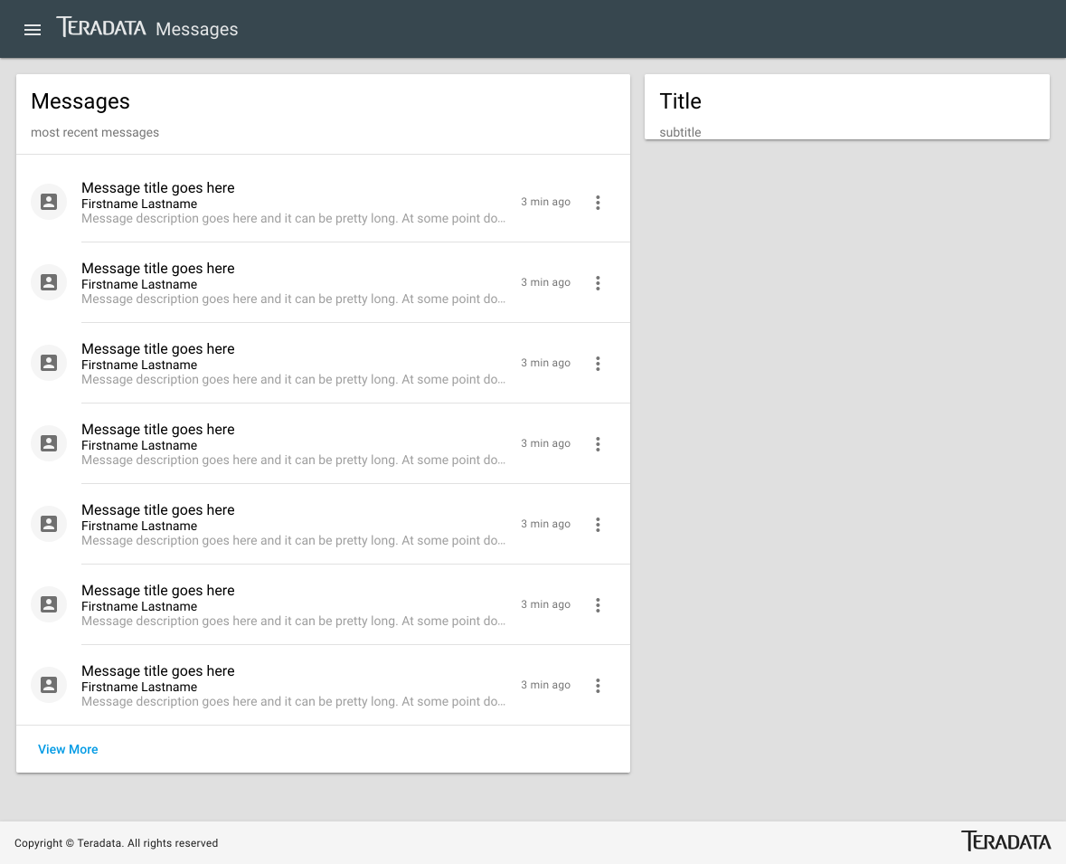
Contacts (users) card
Our right card will be another list, but focused on user info
Instead of a ... menu button we'll instead us a send message button for each list item
      <md-card>
        <md-card-title>Contacts</md-card-title>
        <md-card-subtitle>your list of contacts</md-card-subtitle>
        <md-divider></md-divider>
        <md-list>
          <md-list-item>
              <md-icon md-list-avatar>contact_mail</md-icon>
              <h4 md-line>Firstname Lastname</h4>
              <p md-line>[email protected]</p>
              <button md-icon-button><md-icon>email</md-icon></button>
          </md-list-item>
          <md-divider md-inset></md-divider>
        </md-list>
        <md-divider></md-divider>
      </md-card>
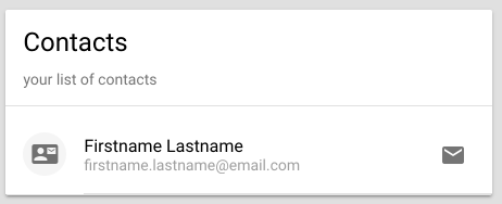
Add a Tooltip
Since that icon might be ambiguous we'll add a tooltip. Only add very shirt descriptve tooltips to things like icons that aren't 100% clear.
Tooltip in Angular Material https://material.angular.io/components/component/tooltip
so we'll use a tooltip and position it before (the the left):
<button md-icon-button mdTooltip="Send message" mdTooltipPosition="before">
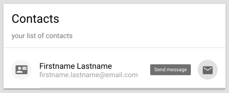
Since we have lots of contacts (we're popular) we can add a dense attribute to md-list or md-nav-list
<md-list dense>
Starting to look like an app!
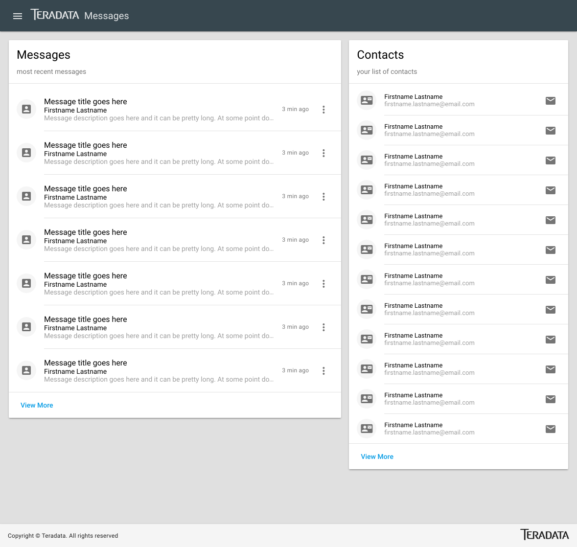
Floating Action Button (FAB)
We can't have a Material Design app without a FAB! Even though the UX is wildly debated, FABs certainly grab your attention, so you have to follow best practices:
- only ONE per page
- assign the primary ACTION of the page to the button
- use an accent color
- use in the proper location (bottom right of the nav view)
right before the closing </td-layout-nav> let's add a FAB button with a tooltip
  <a md-fab color="accent" class="md-fab-position-bottom-right" mdTooltip="Send message" mdTooltipPosition="above">
    <md-icon>message</md-icon>
  </a>
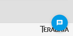
Uh oh we have a problem! Our FAB is overlapping the optional td-layout-footer. Since this isn't always present, let's create a style that will ONLY affect this view.
Shadow DOM SCSS
In Angular 2, each component can have optional SCSS. The SCSS can be normal CSS, Shadow DOM or Emulated Shadow DOM.
Shadow DOM & Emulated Shadow DOM ONLY affect the component, and nothing else.
ProTip: If you want to add global styles, add them to /src/styles.scss
/src/app/overview/overview.component.scss
.md-fab-position-bottom-right {
    bottom: 60px;
}
That looks better!
Let's inspect the code to see how Emulated Shadow DOM is working:
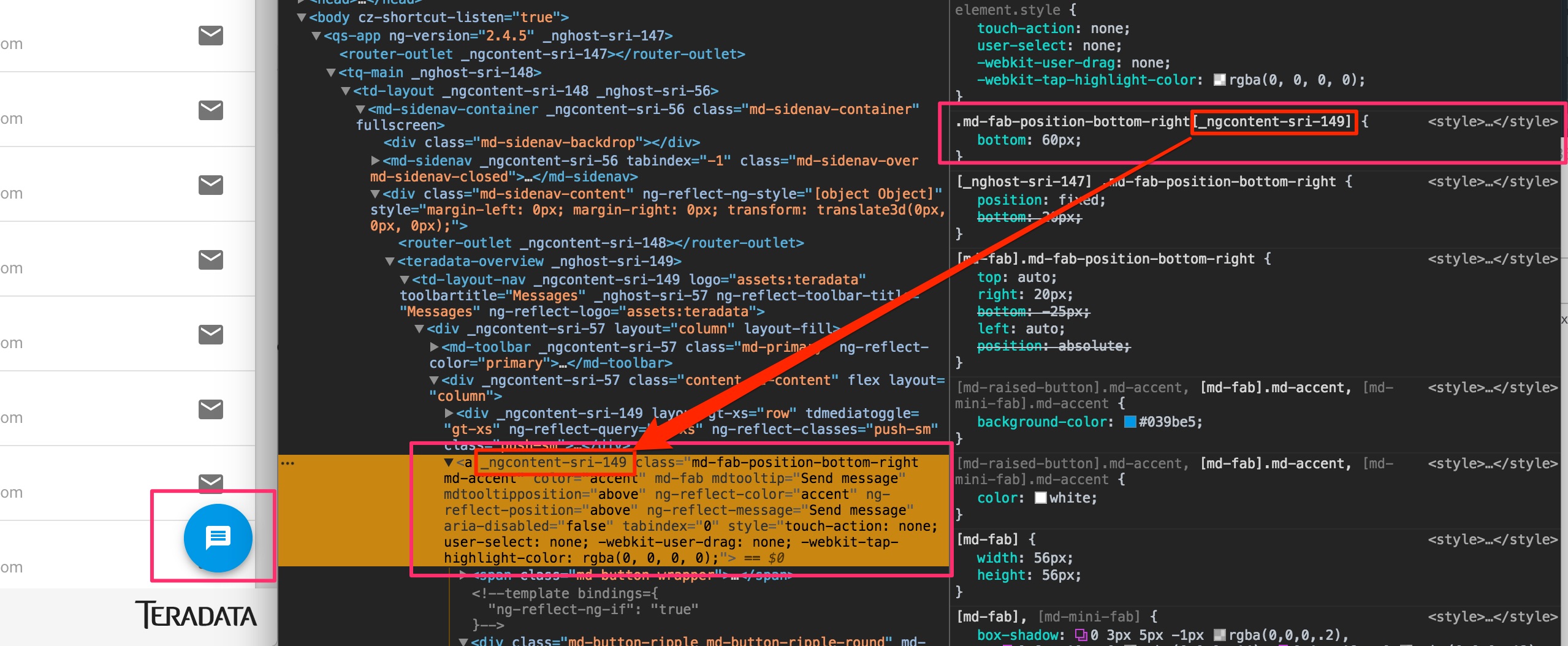
If you inspect the code you'll first find a parent component for the entire component route:
<teradata-overview _nghost-sri-149>
Every style will get a matching CSS attribute [_nghost-sri-149]
Every html element inside also gets this unique attribute so our FAB style is
.md-fab-position-bottom-right[_ngcontent-sri-149]
Guaranteeing it will on work on THAT CLASS in THIS COMPONENT.
If you change Angular 2 from Emulated to Native Shadow DOM, everything will still work but via real Shadow DOM instead of these unique attributes.
Toolbar Buttons
By default we easily have our App logo & title in the top toolbar, but what if we want more content up there?
Head to Covalent layout docs
https://teradata.github.io/covalent/\#/layouts
Of the 4 layouts you can use, we're using the Nav View which is best for homepage dashboards & overviews:
https://teradata.github.io/covalent/\#/layouts/nav-view
In the docs we find that we can override the content by using an Angular directive. Through the magic of Angular components you can place this anywhere, but for code readability let's put it right after the <td-layout-nav
<td-layout-nav logo="assets:teradata" toolbarTitle="Messages">
  <div td-toolbar-content>
    .. main toolbar content
  </div>

Ok obviously not the placement we want, we'd content to be on the right. Much like the md-list, the md-toolbar has some built-in flexbox, so we can use Covalent flexbox parameters in it. Adding a simple flex will flex the div to fill the space
  <div td-toolbar-content flex>
    .. main toolbar content
  </div>
but then we want the inside content to have a flexbox layout so we add layout properties
<div td-toolbar-content flex layout="row">
and to fill the inner spacing let's add a span with flex:
<span flex></span>
lastly let's add a button with a link to help and a help icon & tooltip and here's our final code:
  <div td-toolbar-content flex layout="row">
    <span flex></span>
    <a md-icon-button mdTooltip="Help"><md-icon>help</md-icon></a>
  </div>
which looks like:
![]()