Flexbox Layout (Grid)
Covalent layout docs https://teradata.github.io/covalent/\#/layouts
Angular-Material v1 layout docs https://material.angularjs.org/latest/layout/introduction
Covalent comes with the original CSS Flexbox layout from Angular-Material 1. The team chose to omit the Flexbox layout from v2 and split it out into a pure javascript versions (flexbox-layout) which you can optionally use.
What we're building
https://plnkr.co/edit/UoDd33IYWM8BNpiRwuxd?p=preview
Holy Grail Layout
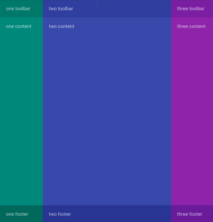
To illustrate the power of flexbox, we'll quickly and easily build the web developer "holy grail" layout for apps with responsive left/right columns, a main content area, and sticky bottom footers.
Understanding Flexbox
Put simply, flexbox revolves around the notion of html elements "flexing". They can flex to fill all the remaining space either horizontally or vertically. Heights and widths can be specific in px or %, or just fill the remaining space. Beyond that flexbox allows easy transformation of ordering and alignment.
Use of colors in demo
To illustrate our demo we'll use the material design background colors available in Covalent utilities styles. We'll leave this markup out to avoid confusion.
Flex Row
Use the attribute layout="row" on any item to create a row of items.
    <div layout="row">
      <div>one</div>
      <div>two</div>
      <div>three</div>
    </div>

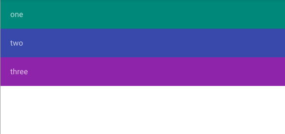
Notice the items fill the container div's width. Our div here doesn't fill 100% therefore the child divs only fill the available space.
Flex Column
By simply changing the layout="row" to layout="column" we now have 1 column with 3 children
    <div layout="column">
      <div>one</div>
      <div>two</div>
      <div>three</div>
    </div>
Layout Fill
For our parent item if we want to fill the screen we use layout-fill (and go back to a row)
    <div layout="row" layout-fill>
      <div>one</div>
      <div>two</div>
      <div>three</div>
    </div>
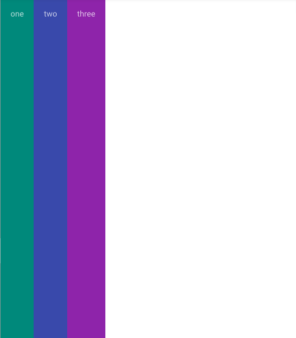
Great! now we want our middle column to "flex" and fill the remaining space like a content area
Flex attribute on a child element
    <div layout="row" layout-fill>
      <div>one</div>
      <div flex>two</div>
      <div>three</div>
    </div>
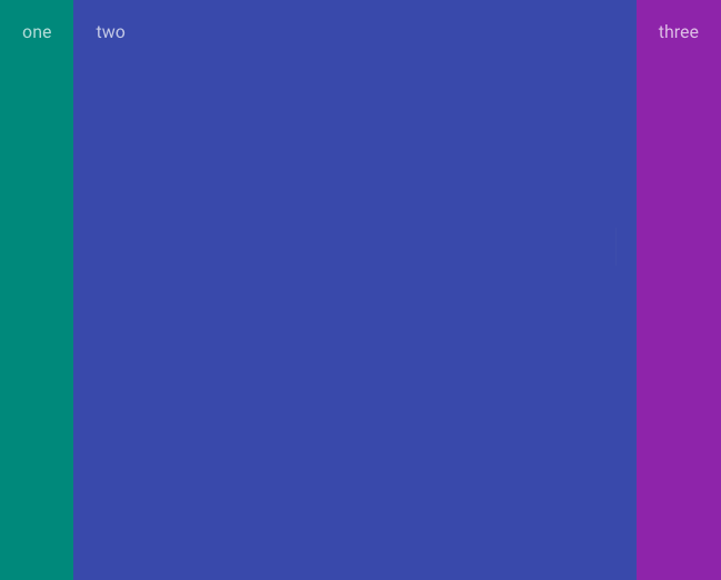
This is starting to look like a layout!
Flex widths
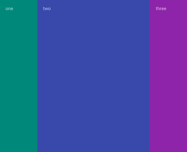
Now let's add some flex percentage widths on our sidebars, any number is treated as a fluid percentage. If we want a specific width just write CSS classes for pixels.
Notice the <div flex> still fills the remaining space
    <div layout="row" layout-fill>
      <div flex="20">one</div>
      <div flex>two</div>
      <div flex="20">three</div>
    </div>
Responsive resizing, ordering and collapsing
For virtually ANY flex layout attribute you can bolt on a responsive suffix like:
layout-gt-xs="row"
This means layout row greater than xs, which means on xs the layout features will be disabled and stack up responsively
Breakpoints
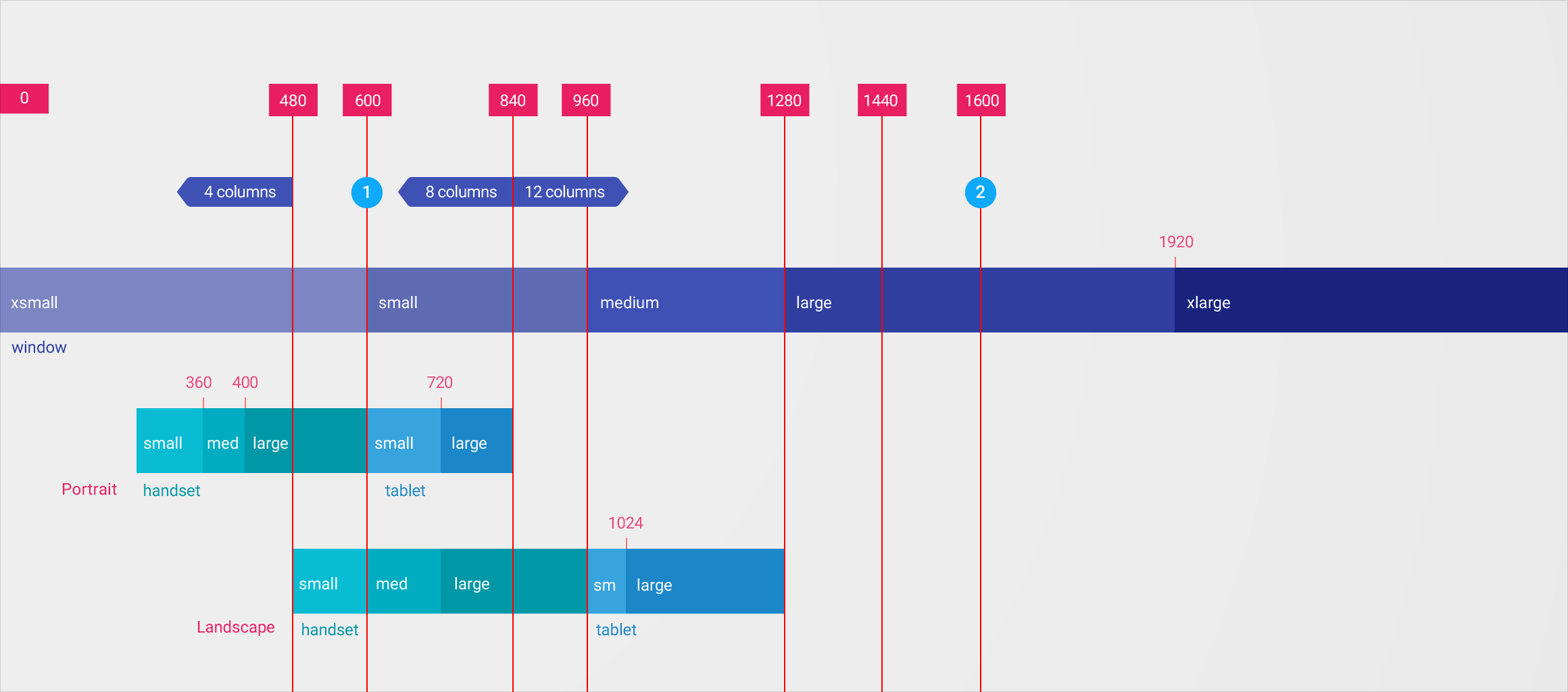
We have these options available, and you can mix and match:
- xs: 599px max
- gt-xs: 600px min
- sm: 600px-959px
- gt-sm: 960px min
- md: 960px-1279px
- gt-md: 1280px min
- lg: 1280px-1919px
- gt-lg: 1920px min
- xl: 1920px min
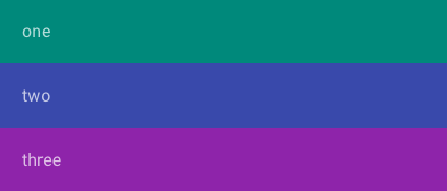
So by adding -gt-xs on all our flex and layout attributes we now have responsive columns on xs (0 - 599px):
    <div layout-gt-xs="row" layout-fill>
      <div flex-gt-xs="20">one</div>
      <div flex-gt-xs>two</div>
      <div flex-gt-xs="20">three</div>
    </div>
Toolbars and Footers
You can nest layout and flex properties to use flexbox inside the layout. Always remember the height and flex properties of the parent element has effects on the children.
Since we currently have 3 columns using a row layout (greater than xs), we'll use a column layout (greater than xs) to create a toolbar, content and footer for each.
All we need to do to start is add layout-gt-xs="column" to the children
    <div layout-gt-xs="row" layout-fill>
      <div flex-gt-xs="20" layout-gt-xs="column">
        <div>one toolbar</div>
        <div>one content</div>
        <div>one footer</div>
      </div>
      <div flex-gt-xs>two</div>
      <div flex-gt-xs="20">three</div>
    </div>
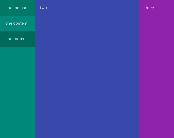
But notice that nothing is flexing!
Simply add a flex-gt-xs on the content area to fill the space and the toolbar will be on top while the footer sticks to the bottom
    <div layout-gt-xs="row" layout-fill>
      <div flex-gt-xs="20" layout-gt-xs="column">
        <div>one toolbar</div>
        <div flex-gt-xs>one content</div>
        <div>one footer</div>
      </div>
      <div flex-gt-xs>two</div>
      <div flex-gt-xs="20">three</div>
    </div>
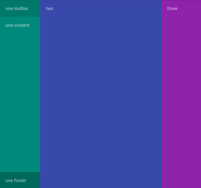
Let's rinse and repeat for all 3:
    <div layout-gt-xs="row" layout-fill>
      <div flex-gt-xs="20" layout-gt-xs="column">
        <div>one toolbar</div>
        <div flex-gt-xs>one content</div>
        <div>one footer</div>
      </div>
      <div flex-gt-xs layout-gt-xs="column">
        <div>two toolbar</div>
        <div flex-gt-xs>two content</div>
        <div>two footer</div>
      </div>
      <div flex-gt-xs="20" layout-gt-xs="column">
        <div>three toolbar</div>
        <div flex-gt-xs>three content</div>
        <div>three footer</div>
      </div>
    </div>
💥 Holy Grail

Extra (small) Credit
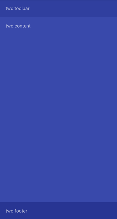
Ok so let's check xs
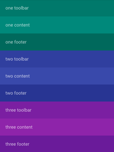
While this is technically responsive let's mimic a real app, where you'd hide the sidenavs and still fill the content area.
Hiding & visibility attributes
Along with all the flexbox responsive options we can also hide and show elements responsively
| hide | show (overrides hide) |
|---|---|
| hide-xs | show-xs |
| hide-gt-xs | show-gt-xs |
| hide-sm | show-sm |
| hide-gt-sm | show-gt-sm |
| hide-md | show-md |
| hide-gt-md | show-gt-md |
| hide-lg | show-lg |
| hide-gt-lg | show-gt-lg |
| hide-xl | show-xl |
Hide the sidebars
We can simply use a hide-xs to hide the left and right sidebars.
    <div layout-gt-xs="row" layout-fill>
      <div hide-xs flex-gt-xs="20" layout-gt-xs="column">
        <div>one toolbar</div>
        <div flex-gt-xs>one content</div>
        <div>one footer</div>
      </div>
      <div flex-gt-xs layout-gt-xs="column">
        <div>two toolbar</div>
        <div flex-gt-xs>two content</div>
        <div>two footer</div>
      </div>
      <div hide-xs flex-gt-xs="20" layout-gt-xs="column">
        <div>three toolbar</div>
        <div flex-gt-xs>three content</div>
        <div>three footer</div>
      </div>
    </div>
BUT if we do this, we'll have to remove the -gt-xs requirements on the main layout and the content area so the flex will work on xs:
   <div layout="row" layout-fill>
      <div hide-xs flex-gt-xs="20">
        <div>one toolbar</div>
        <div flex-gt-xs>one content</div>
        <div>one footer</div>
      </div>
      <div flex layout="column">
        <div>two toolbar</div>
        <div flex>two content</div>
        <div>two footer</div>
      </div>
      <div hide-xs flex-gt-xs="20" layout-gt-xs="column">
        <div>three toolbar</div>
        <div flex-gt-xs>three content</div>
        <div>three footer</div>
      </div>
    </div>
which now will look correct on mobile:
